
Recent weeks have led to a fairly significant drop in stock valuations, with many expert analysts struggling to figure out exactly why it’s happening. You’ll hear them cite the weather, or market overreaction, or any number of reasons for why stocks have seen their share prices reduced and why they’ll be rebounding in the near-term.
What they won’t show you on mainstream financial channels is what’s really happening behind the scenes.
Forget about all the minute-by-minute noise for a moment and take a look at the following chart. It gives a very simple overview of earnings growth trends for stocks listed on the S&P 500 on a quarterly basis.
Last year saw what analysts would call fairly robust growth, and they had no problem citing these numbers for evidence of economic recovery.
We’re curious what they’d call it now, considering this chart shows a massive collapse in earnings per share growth across the board.
Pay close attention to that yellow line, which indicates growth (or lack there of) for the first quarter of 2014. According to Zero Hedge this is a Flashing Red Warning as earnings growth plunges to its lowest levels since 2012:
While the so-called “experts” were adamant in repeating that one must ignore all Q1 economic data (because of harsh weather you know), one thing the same “experts” pounded the table on was the earnings growth in 2014 which confirmed that the Fed was correct in tapering and that the corporate sector was well on its way to achieving “escape velocity” and a stable recovery. And then this happened…
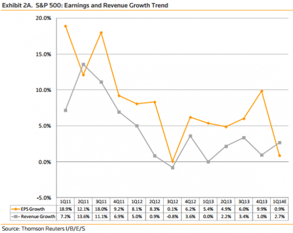
(Chart via @Not_Jim_Cramer)
Most people, when you ask them how the economy is doing, will point to the Dow Jones, NASDAQ and S&P 500 as evidence of a healthy recovery.
What the majority of those people fail to look at is the underlying valuations for the stocks within those indexes.
If you are an investor and hold stocks, or are thinking about jumping in because this latest “correction” is about to take a turn for the better, we direct your attention to this absolutely critical piece of information regarding price-per-earnings from Karl Denninger of Market Ticker.
A bit of perspective is in order here. The number of stocks that have been trading on nothing more than QE-addled leverage, with nosebleed territory P/Es including Facebook (96), Amazon (537!), Netflix (180), LinkedIn (762), Salesforce (Negative P/E) and Twitter (ditto; -$3.41 EPS.)
Yeah, but the market is “cheap”, right? Sure it is with all these big-cap techs trading at prices like this…
…
There is only one reason to buy such a stock — you’re convinced that some other sucker will pay you an even greater multiple to sales (say much less earnings) than you paid.
That the air will eventually come out of such a market is inevitable.
The P/E ratio of a stock is basically the price of the stock compared to the earnings of said share. In the case of Amazon trading at 537 times earnings, this is an INCREDIBLE number considering most conservative financial advisers recommend dividend earning stocks in the 10 – 12 P/E range for investment purposes. In essence, the easiest way to interpret Amazon today is that an investor is willing to pay $537 for $1 in current earnings. So, investors who bought Amazon stock at its current price should see a return on that investment… in about 537 years (give or take) at current earnings.
Yes, that’s how crazy the stock market is right now, and Amazon is certainly not alone insofar as over-valuation is concerned.
Couple that with the earning growth chart above and you can clearly see that we are in very dangerous territory here.
And this doesn’t even take into account the economic warfare playing out between East and West, where Russia has now announced it will be actively pursuing a strategy to decouple its resource trade from the US dollar, meaning it will now trade in local currencies as opposed to the world’s traditional reserve currency.
As this new form of warfare plays out by the worlds super powers, all monetary systems will be affected. So how is this going to affect you? These effects will cause a continued degradation of the U.S. dollar with the real possibility that China and Russia will stop funding our debt. If and when this happens, the-you-know-what will inevitably hit the fan.
As Paul Craig Roberts noted recently, there is a reckoning coming and all evidence points to economic failure in 2014.
Or, we can all just go along with the prevailing narrative and pretend like happy days are here again.
The following song was released shortly after the 1929 stock market crash before anyone had realized its implications. It reassured Americans that “Your cares and troubles are gone… there’ll be no more from now on.”
We know how that ended up…


0 Comments